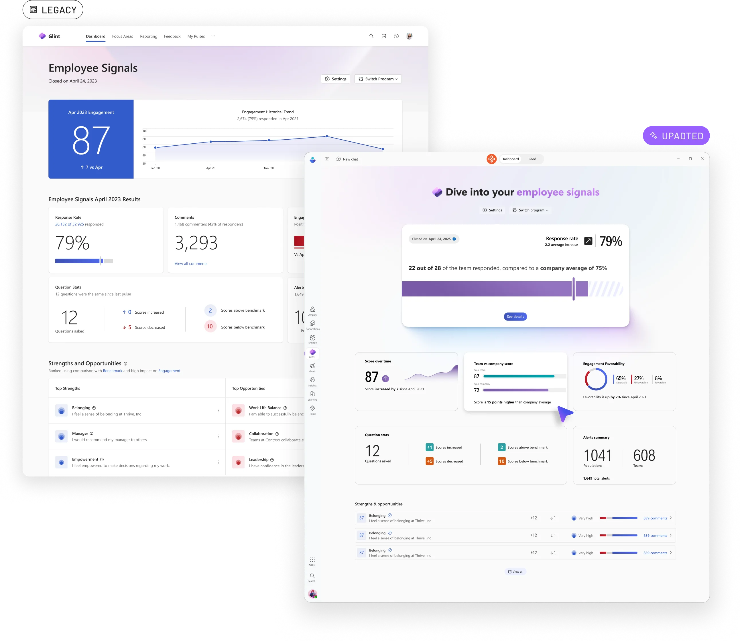
As Microsoft Viva expanded into the consumer space, it became clear that existing Fluent data visualization patterns weren't enough.
As a member of the Viva Personality team and co-lead of Microsoft's Fluent data viz team, I helped drive the exploration of a more expressive approach. This would give product teams greater flexibility to create data experiences tailored to their audiences.
Goals & Challenges
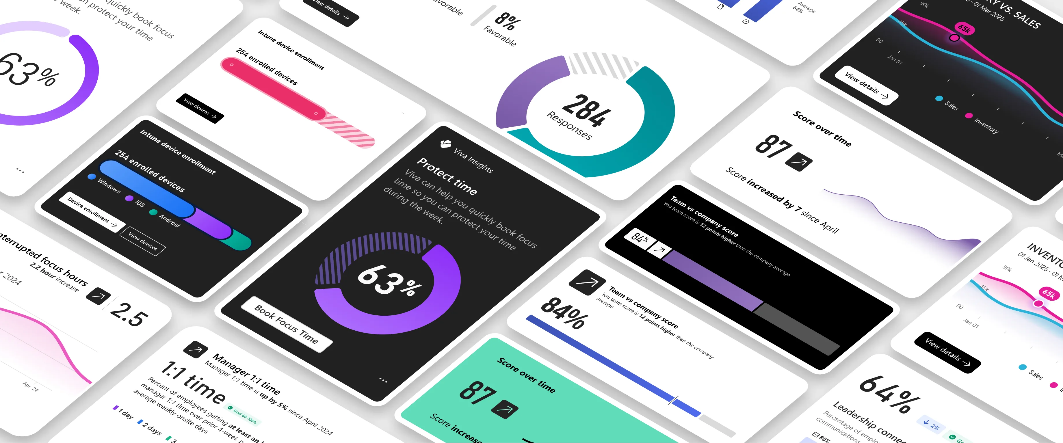
The existing Fluent data visualization library was optimized for enterprise scenarios but felt static in the more consumer-focused Viva experiences. At the same time, Microsoft’s new expressive illustration system offered a vibrant visual language, yet its reliance on 3D forms and inaccessible color palettes made it unsuitable for communicating data.
Our challenge was to bridge these two worlds: creating visualizations that were both expressive and functional. The resulting approach was intended for selective, high-impact moments — such as hero cards and banners — where more engaging visuals could capture attention and encourage deeper exploration of the underlying data.
Proposal
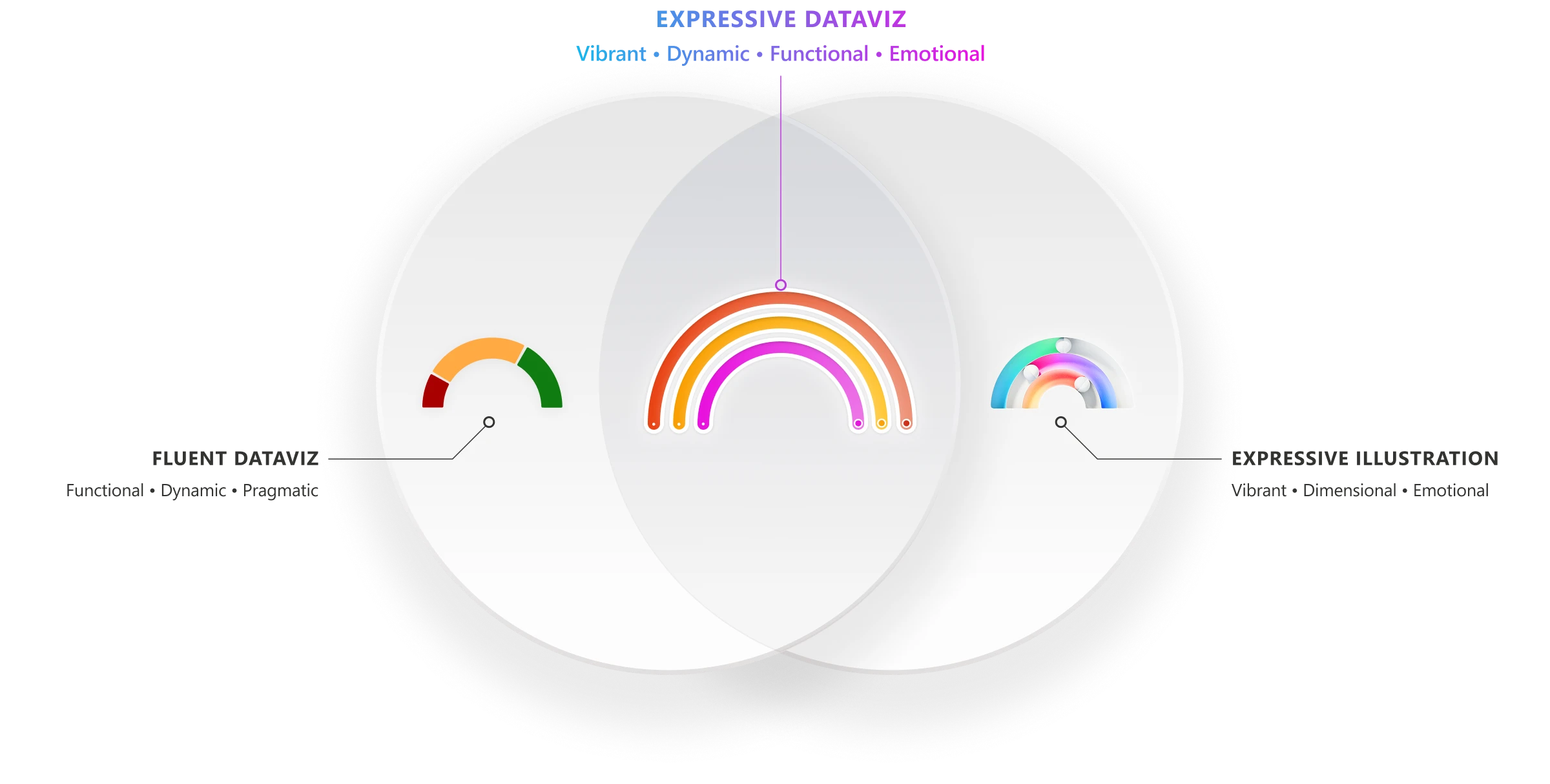
Data visualization serves a broad spectrum of Microsoft products, audiences, and use cases — from casual consumers to data professionals. A single visual language couldn’t effectively meet all of those needs.
Our proposal was to evolve Microsoft’s data visualization system into a spectrum of toolkits, balancing flexibility with a cohesive Microsoft identity. To define what that future could look like, we explored the full visual language including color, gradients, typography, chart styles, and container design. We pushed beyond existing constraints before refining concepts into patterns that could scale across the Microsoft ecosystem.
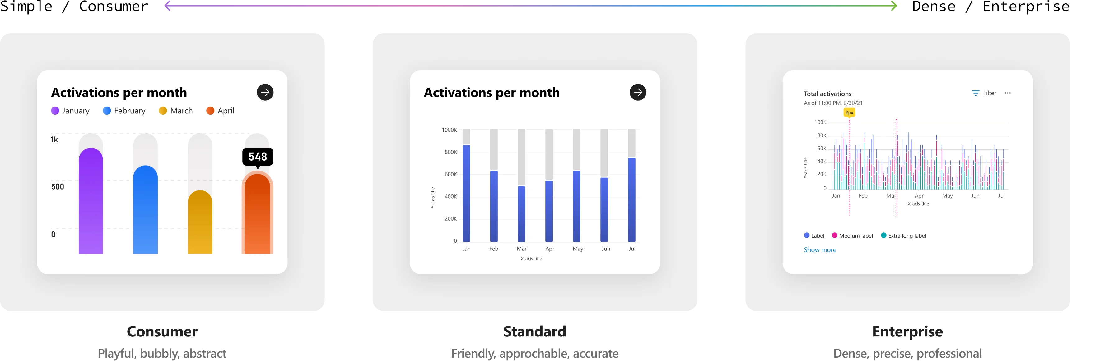
Chart Audit
The Fluent library contains dozens of charts, so it made more sense to focus on a subset of the most common examples.
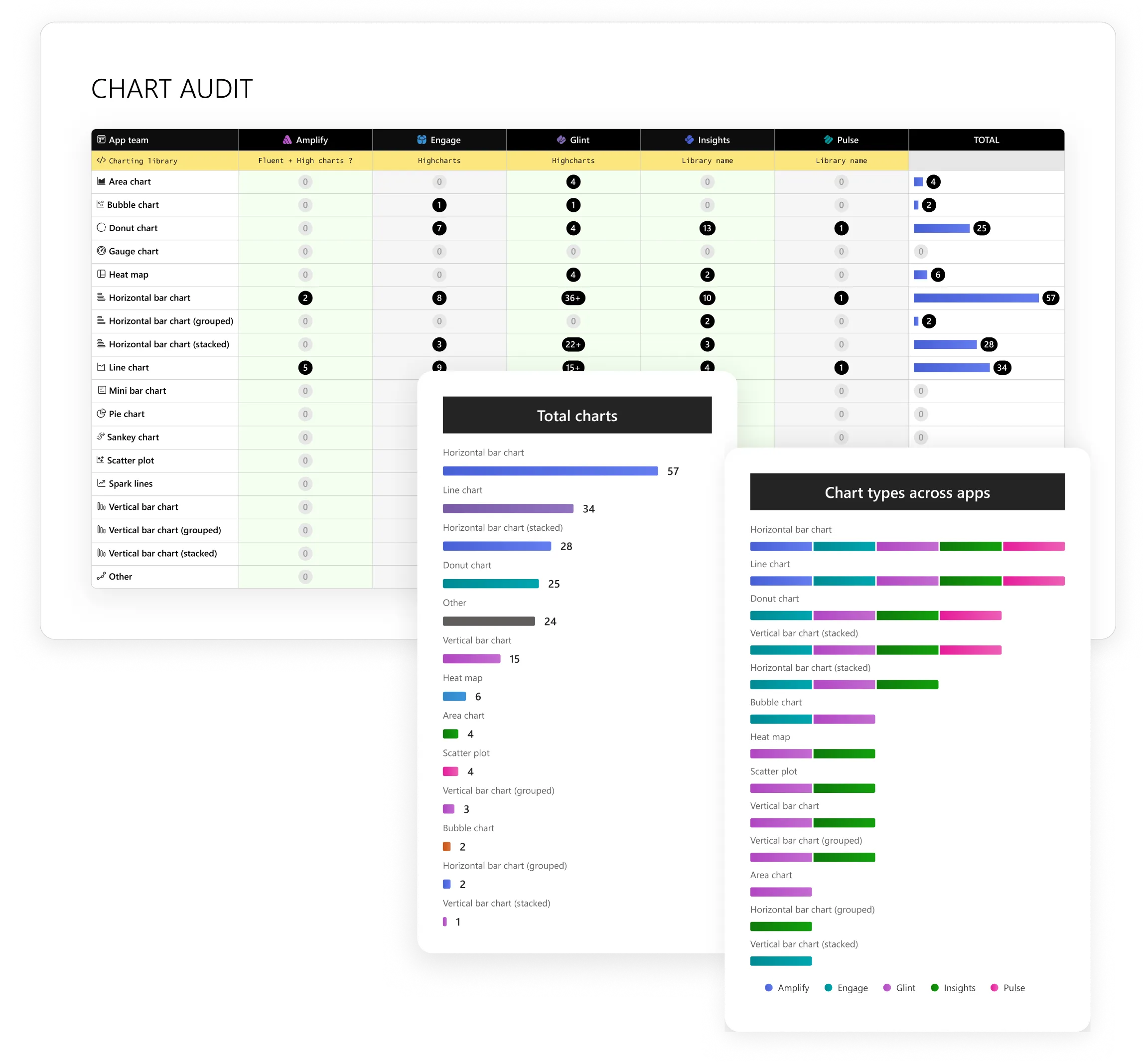
I partnered directly with designers on each of the Viva product teams to help run audits on the most frequently used charts across each app. Once complete, we chose four charts to focus on: horizontal bar, vertical bar, line chart, and donut chart.
Donut Chart
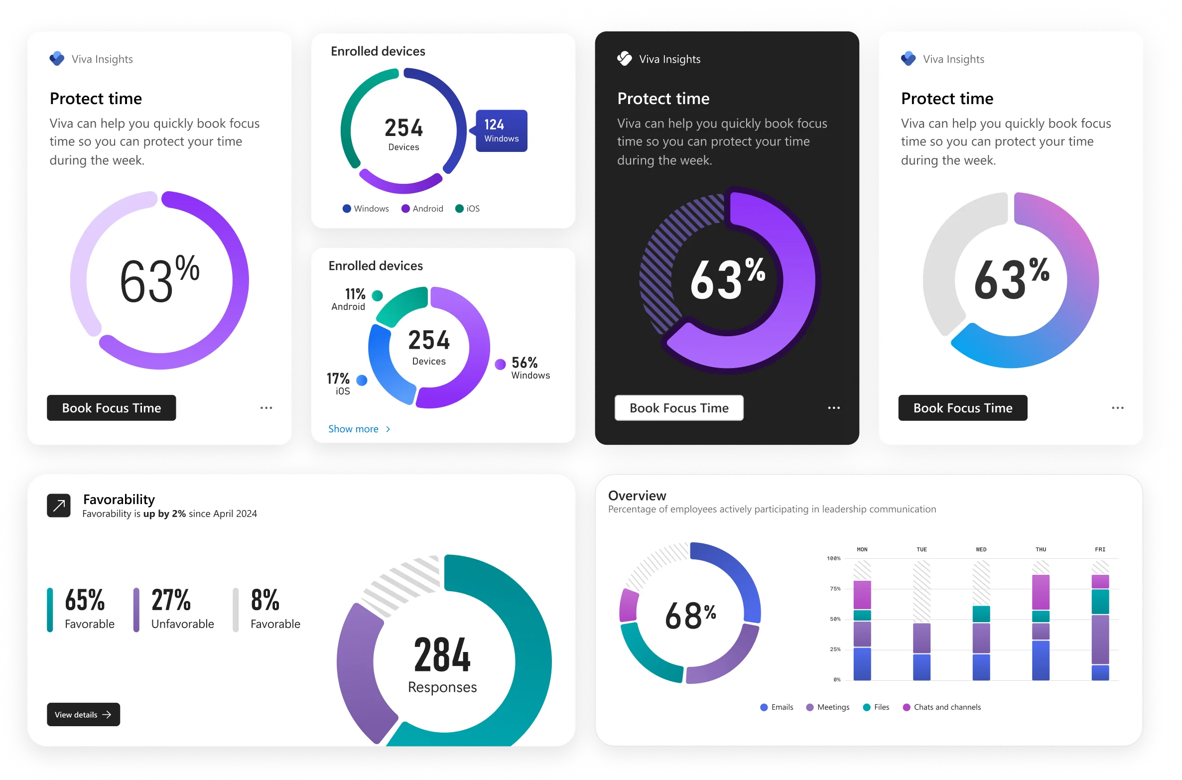
Donut charts visualize how individual parts contribute to a whole. They are most effective for showing percentages across a small number of categories when trends over time are not a factor.
They are inherently easy to understand at a glance, and work best with simple, sparse datasets. This makes them ideal for high-impact applications.
Line Chart
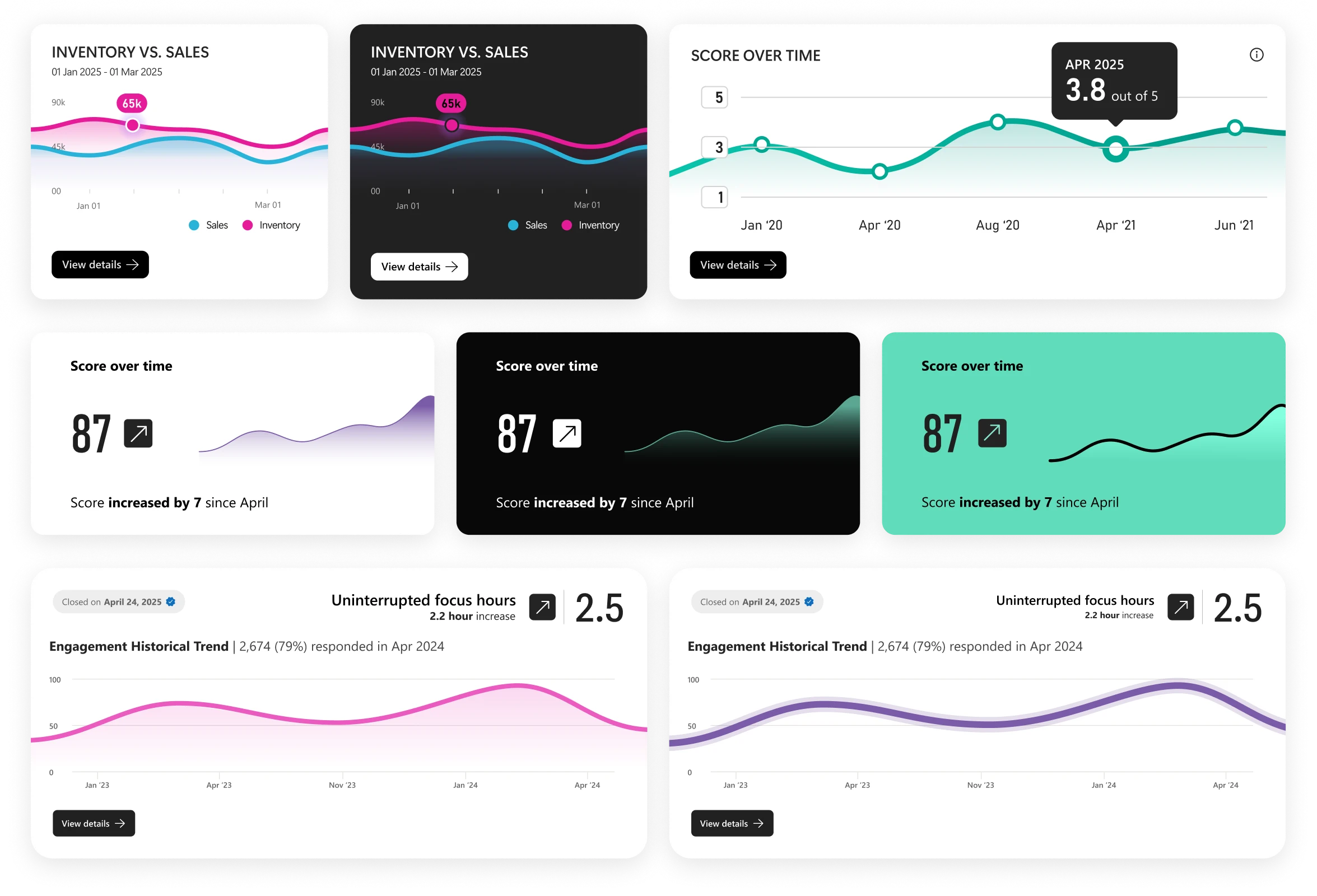
Line charts are used to visualize trends and changes over time by connecting data points along a continuous axis. They are effective for highlighting patterns, rates of change, and comparisons across multiple data series. For clarity, multi-line charts should be limited to a manageable number of series.
To preserve readability, line charts are most effective when limited to a small number of series which makes them good candidates for expressive data viz.
Horizontal Bar Chart
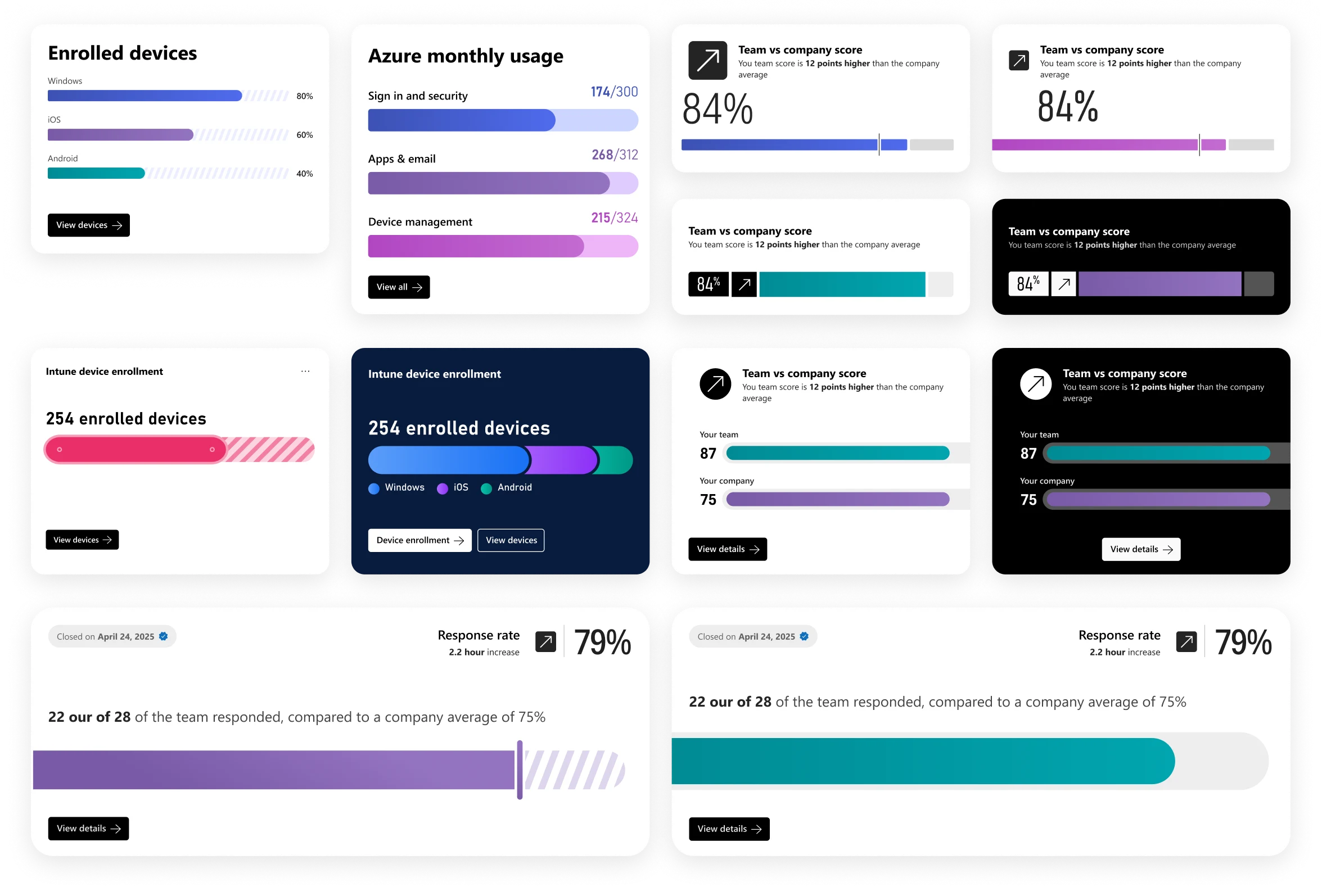
Horizontal bar charts are among the most familiar and accessible visualization types, making them effective across a wide range of audiences and data literacy levels. Their simple structure makes it easy to compare values across categories, especially when labels are lengthy or rankings are important.
Because of their clarity and flexibility, horizontal bar charts provided a strong foundation for exploring how expressive visual treatments could enhance engagement while preserving readability and comprehension.
Vertical Bar Chart
Vertical bar charts compare values across categories using bars aligned to a common baseline. They are particularly effective for highlighting differences in magnitude, comparing datasets, and visualizing changes over time.
Their familiar structure and strong visual hierarchy make them one of the most versatile chart types. For this reason, vertical bar charts served as a useful foundation for exploring how expressive visual treatments could add personality and emphasis while maintaining clarity and comparability.
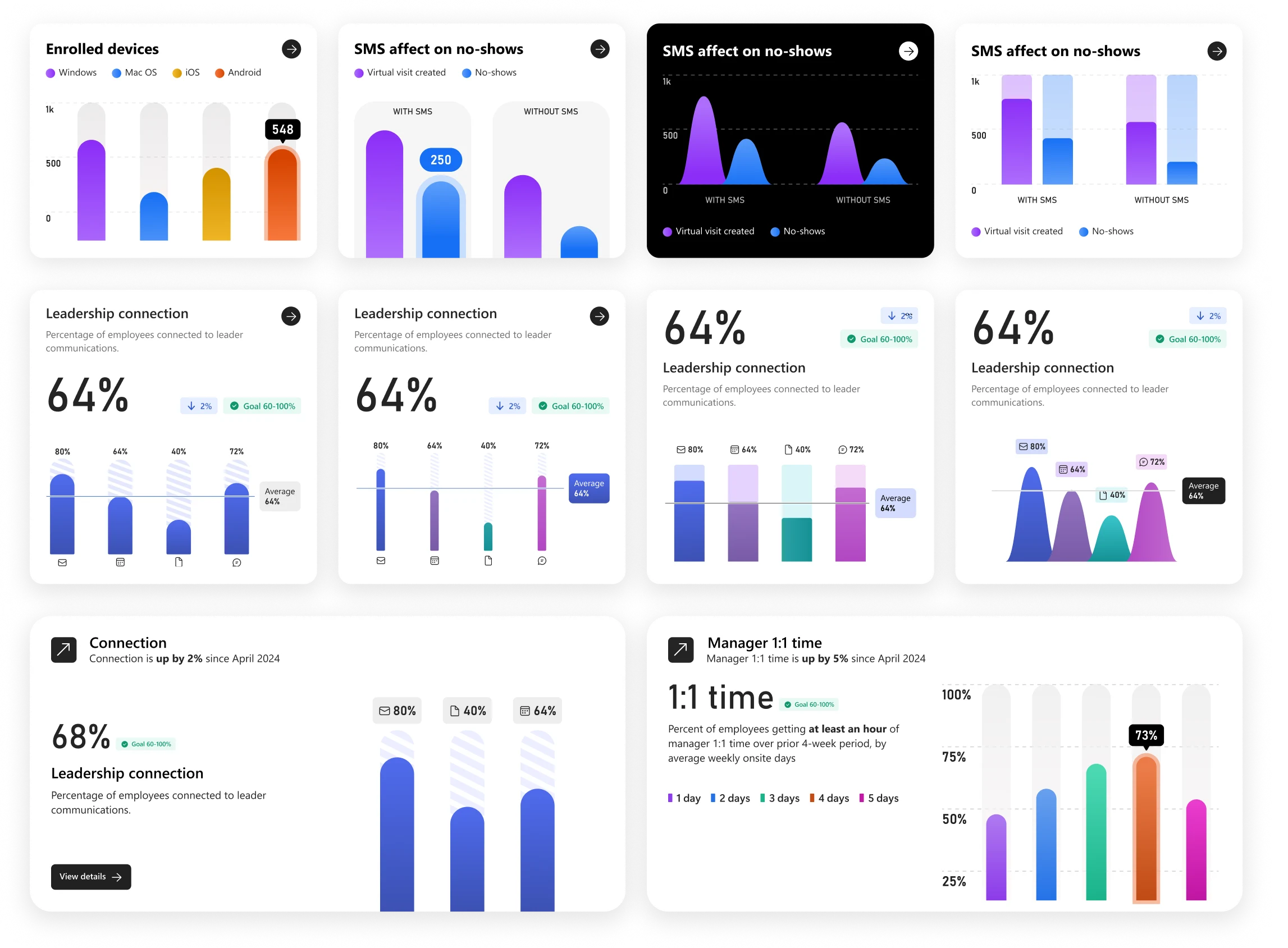
Pressure Testing
The Viva Suite Alignment project offered a valuable opportunity to evaluate expressive charting concepts in a real-world context, comparing them against standard visualizations and testing their fit within emerging Viva design directions.
See the Microsoft Viva Suite Alignment project for more examples of this.