Microsoft Viva is an employee experience platform designed to improve communication, engagement, learning, productivity, and workplace insights.
I partnered with the Viva product teams to help define the brand and create iconography across the suite.
Microsoft Viva Iconography
To support the launch of Microsoft Viva, I collaborated with cross-functional teams to design a cohesive family of icons that established a consistent visual language across the suite.
The Challenge
Designing the Viva iconography system meant creating a brand framework before the full product suite existed. The ecosystem included a mix of newly conceived apps, evolving concepts, and established products with their own visual histories.
Our challenge was to develop a scalable visual language that could unify current and future applications, and distinguish Viva from Microsoft 365 while still feeling unmistakably Microsoft.

Discovery Phase
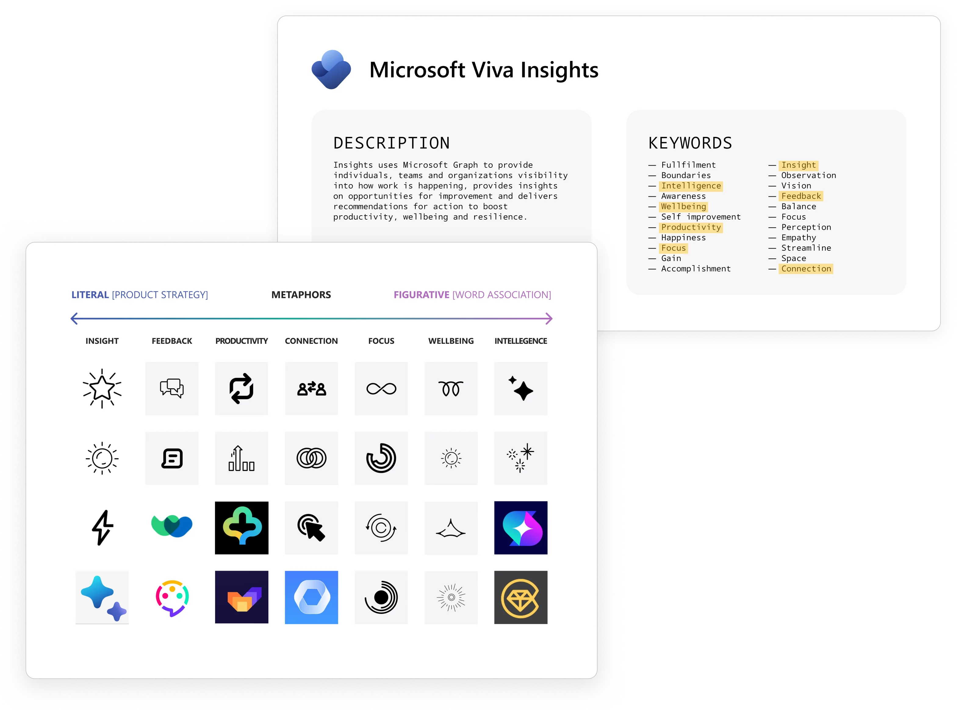
The process began with research and discovery. To inform our early concepts, we conducted competitive research and analyzed product goals, descriptions, and stakeholder input. From there, we mapped key themes to a range of visual metaphors, creating a broad set of icon directions that balanced clarity, differentiation, and brand expression.
Exploration Phase
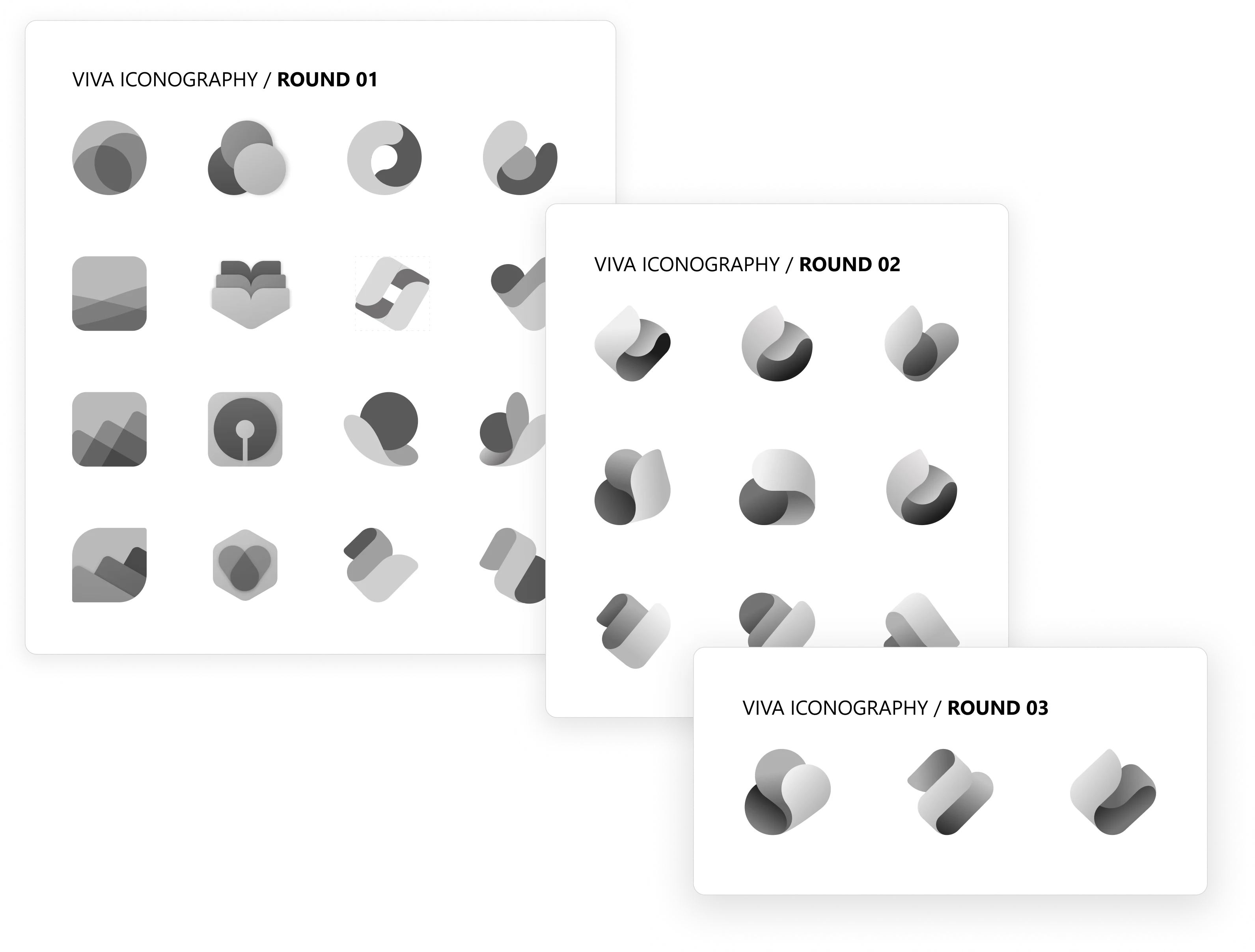
Early explorations focused on translating visual metaphors into icon concepts, using grayscale to evaluate shape, hierarchy, and recognition independently of color (which can have too much influence on shape). Through iterative reviews, we refined the strongest directions and identified “the fold” as a defining characteristic for the system.
The fold became a foundational element of the iconography, creating a consistent visual language that connected individual products while establishing a distinct identity for the Viva suite.
Color Studies
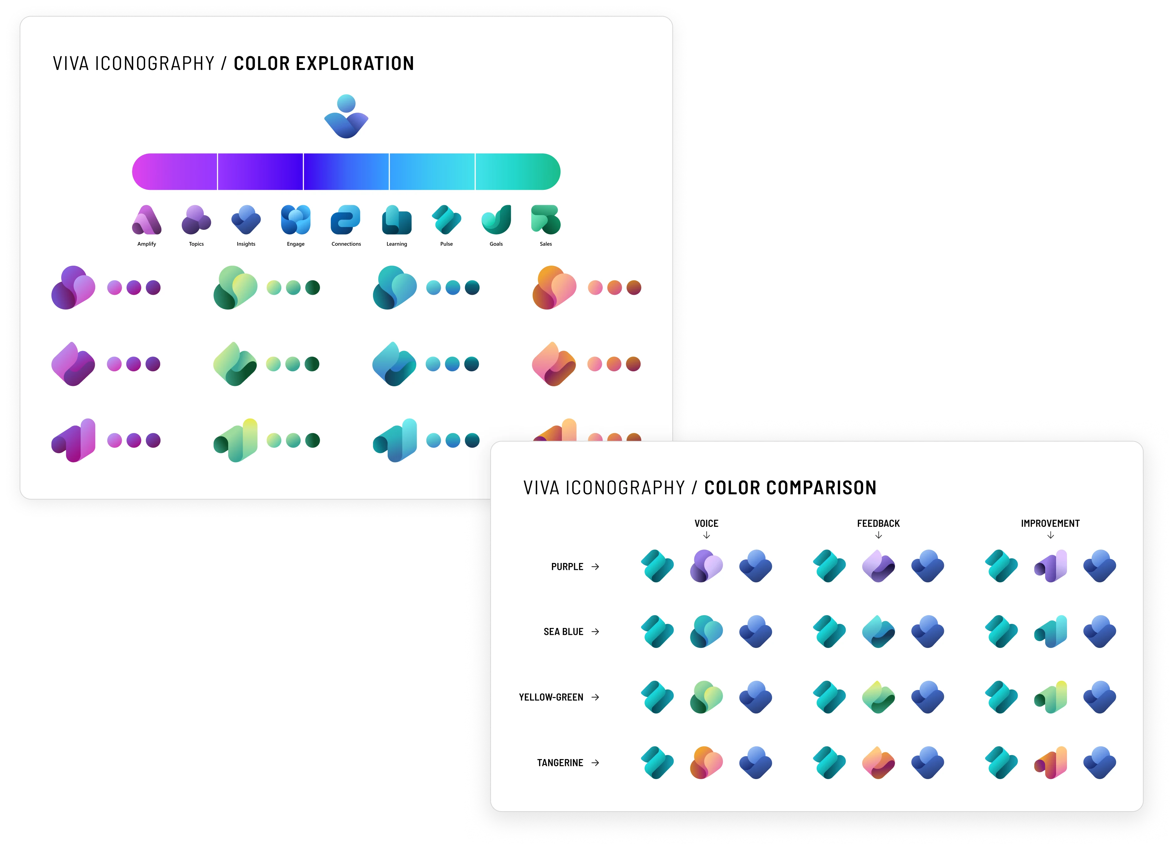
Once the iconography system was defined, we began exploring color to strengthen recognition and product differentiation. Colors were iteratively refined to ensure harmony with Microsoft’s existing product palette while reinforcing a cohesive identity across the Viva suite.
Research
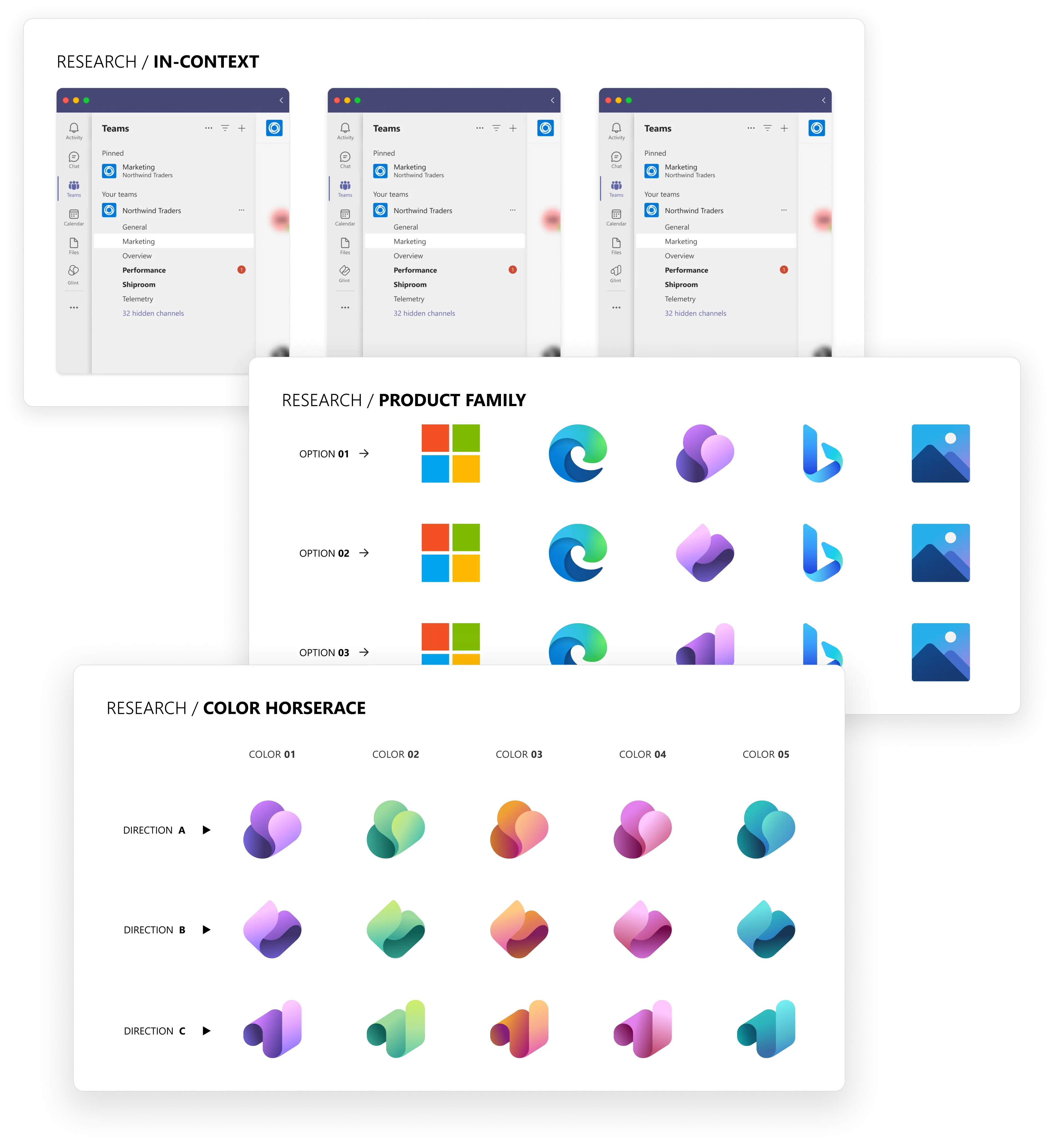
Research played a critical role in the final phase of the project. By testing icon concepts with users across a range of contexts — including standalone icons, product ecosystems, and color variants — we gathered actionable feedback that helped validate assumptions, refine the system, and inform the final icon designs.
Final Iconography
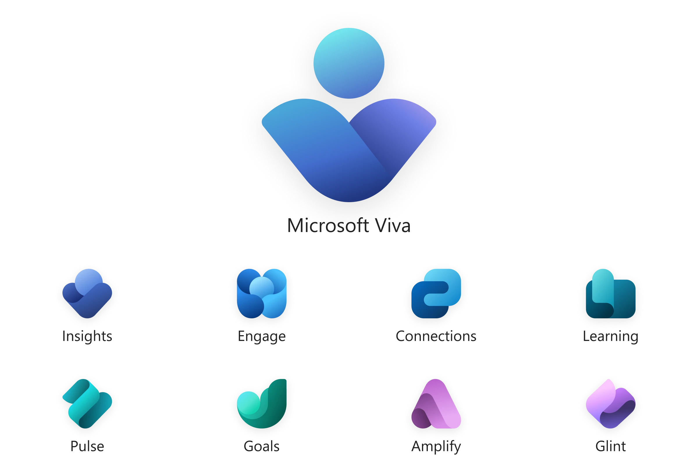
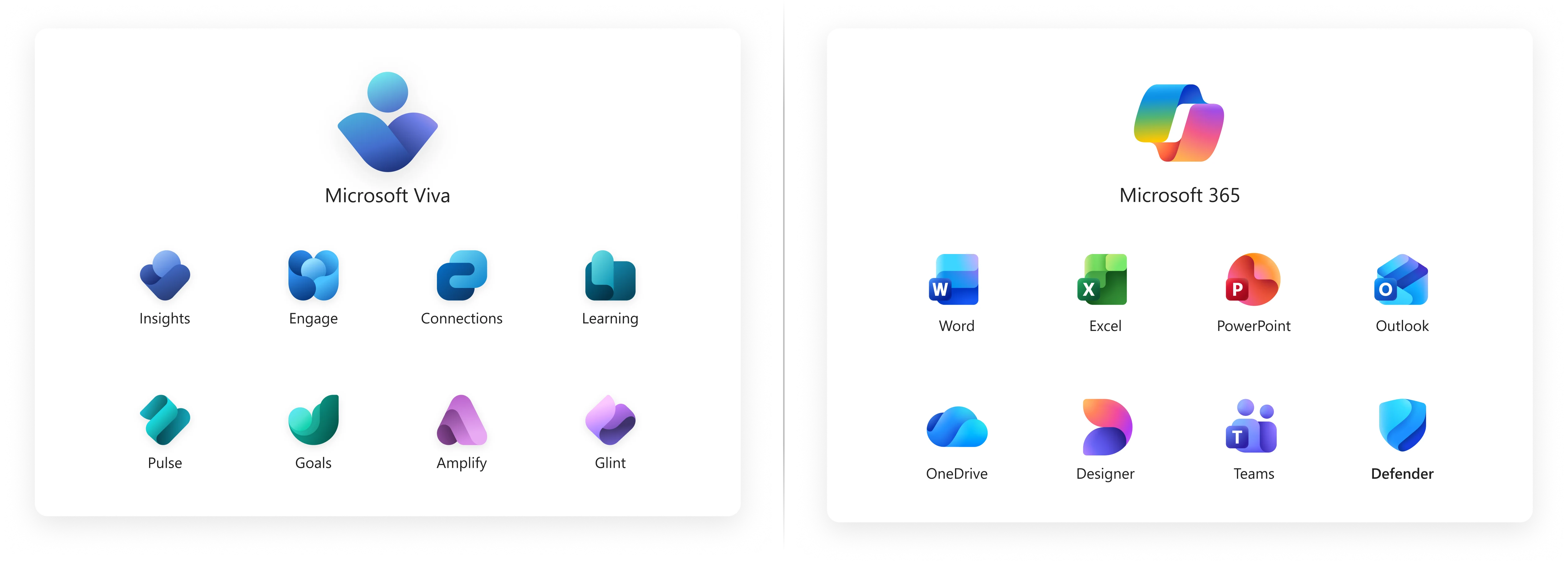
What began as a challenge to brand an evolving collection of products became an opportunity to create a scalable visual system. The final icons balance consistency and differentiation through a shared design language, a cohesive color strategy, and research-driven refinements. The resulting framework unified the Viva suite, established a distinct market presence, and provided a foundation for future products as the platform expanded.
A Lasting Influence
What began as a visual language for Viva ultimately extended beyond the suite itself. The exploration of folds, depth, and expressive color helped inform Microsoft’s evolving iconography system and influenced the refreshed Microsoft 365 product family, creating stronger visual consistency across the ecosystem.
Extra Credit: Viva EXP Studio Icon
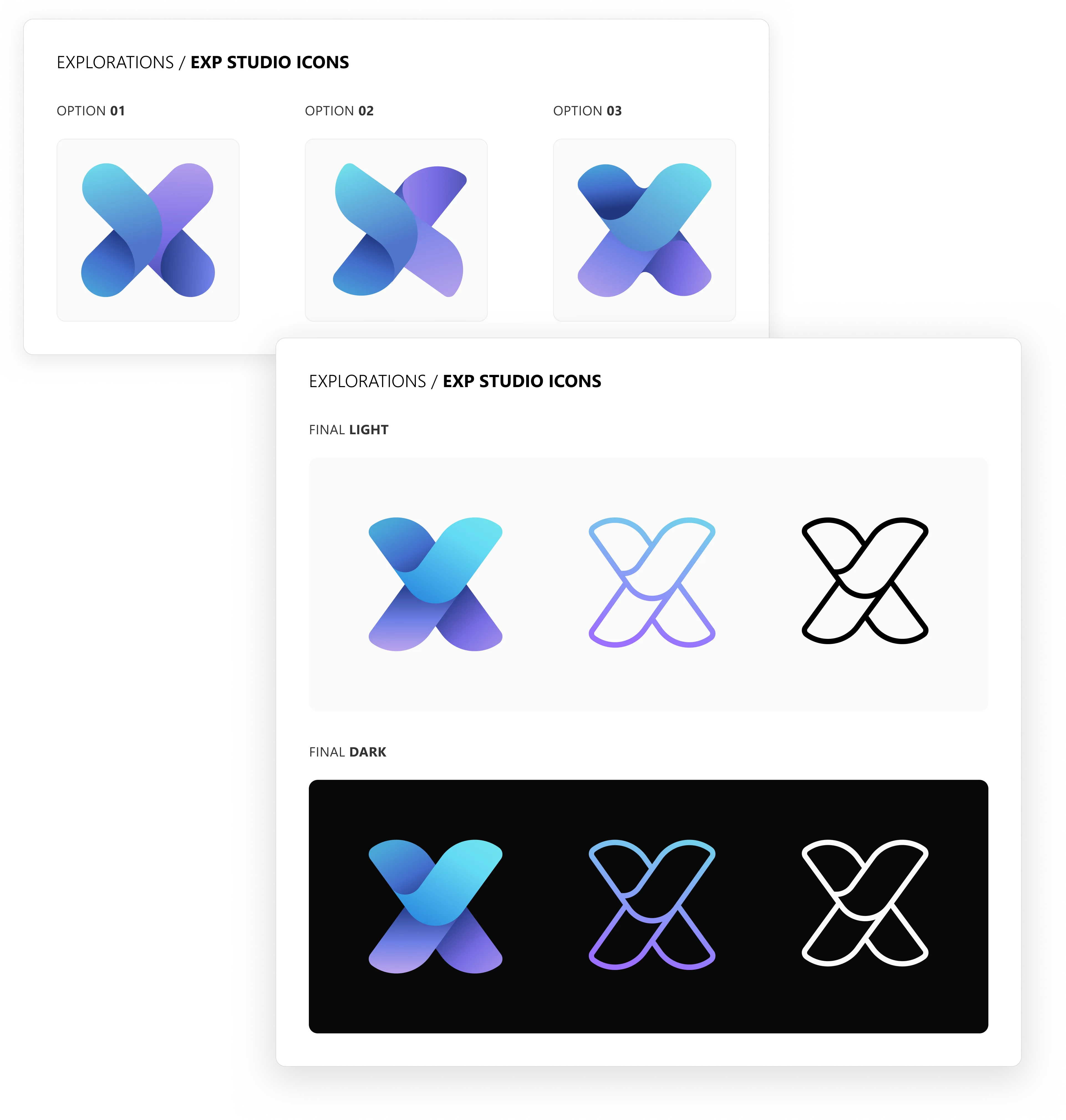
Alongside the product iconography, I also created the identity for the Viva EXP Studio, the design organization established to support the growing Viva ecosystem. The icon served as a bridge between the studio and the products it supported — drawing from the established Viva visual language while symbolizing the experimentation, collaboration, and systems thinking that informed the team’s work.