Many of these projects remain personal favorites, not only for the final results, but for the creative exploration and problem-solving that shaped them.
WRA Creative Communications Branding
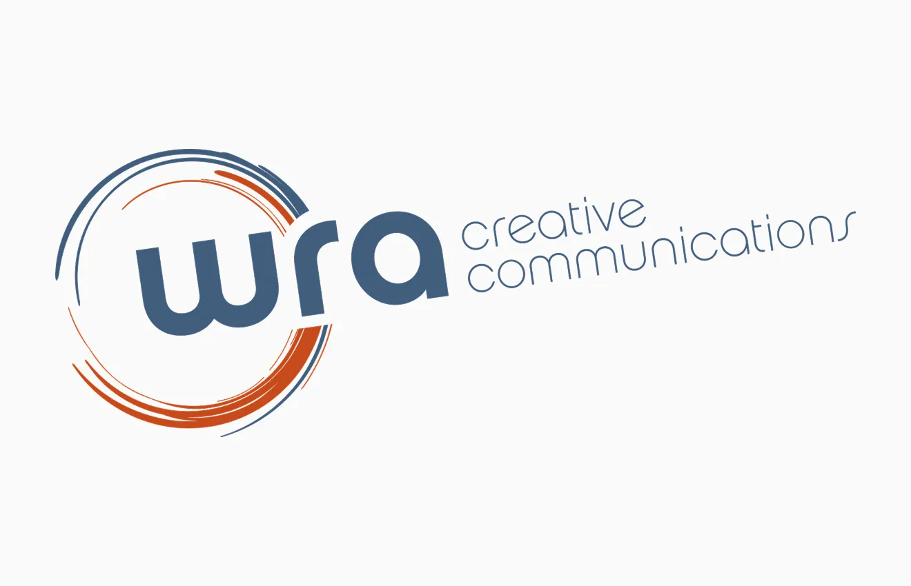
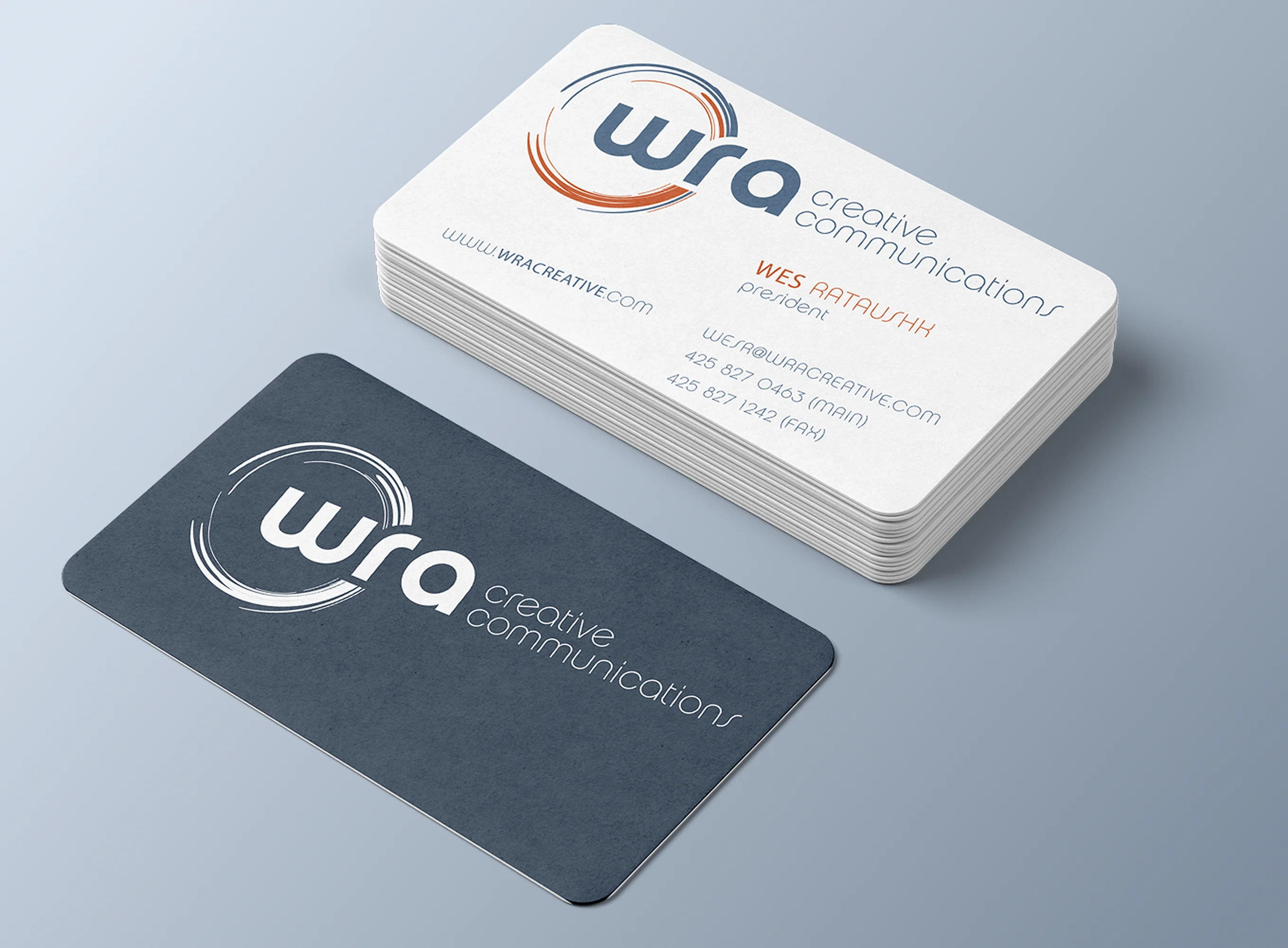
WRA Creative Communications is a full-service marketing communications agency that helps organizations solve complex marketing challenges with smart strategy, compelling content, and effective design across a wide range of industries and clients, including Microsoft, Ford, Kellogg’s, and others. They approached me to create a new identity for their business that could better position them as an innovative, creative agency.
The identity centers on a series of hand-drawn circular forms that symbolize collaboration, connection, and the continuous exchange of ideas. Their imperfect, energetic quality reflects the creative process itself, while the bold “wra” wordmark anchors the composition with clarity and confidence. The result is a distinctive identity that communicates both creativity and professionalism.
Praexis Business Labs
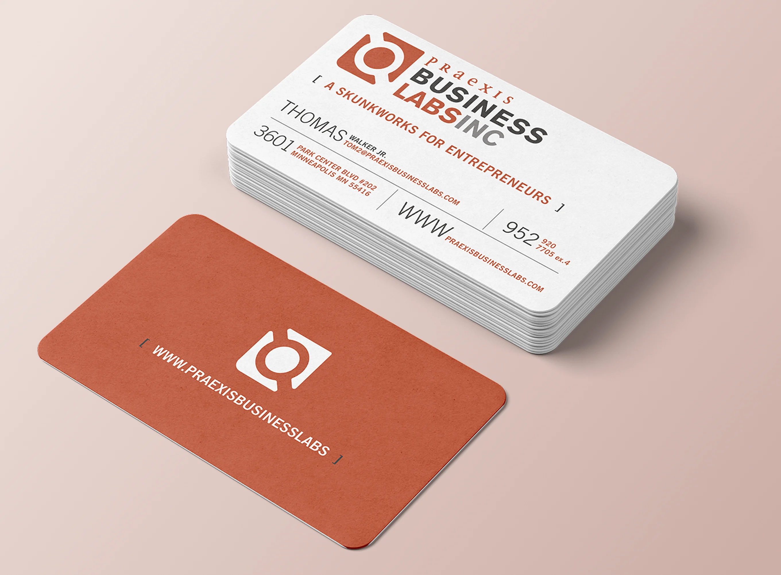
Praexis Business Labs was founded to help organizations navigate change through innovation, strategy, and business transformation. To support this mission, I designed an identity that blends precision with momentum.
The circular center represents ideas, discovery, and insight, and the surrounding structure suggests being grounded while also advancing towards the future.
For the typographic lockup, “Praexis” is rendered in an elegant serif with wide tracking, evoking expertise, insight, and strategic thinking. “Business Labs” shifts to a bold sans-serif, emphasizing experimentation, action, and results. Together, the two type styles create a visual balance between intellectual rigor and practical application — the core principles behind the company’s approach to business transformation.


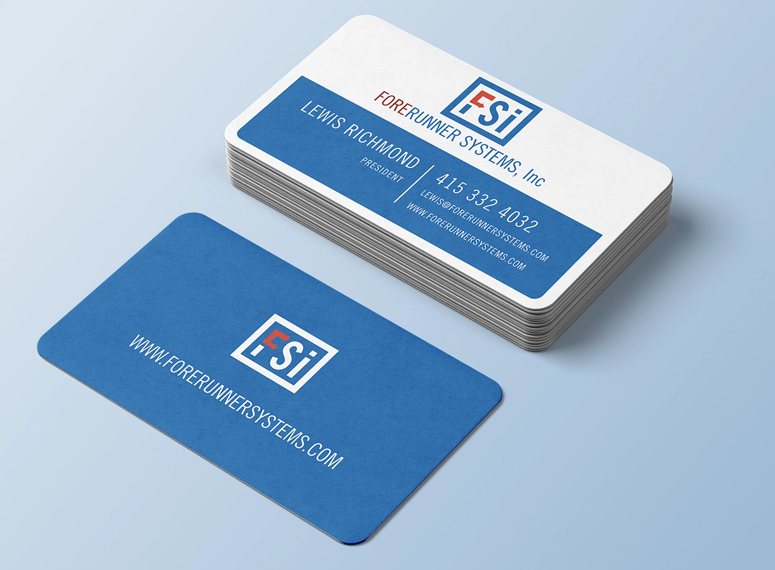
Forerunner Systems
When designing the Forerunner Systems identity, I wanted to capture the core purpose of the company: helping businesses look beyond the next quarter and make decisions with greater confidence.
The name “Forerunner” naturally evokes leadership, foresight, and the ability to see opportunities before others do.
That idea became the foundation of the brand. The visual system was designed to feel intelligent, dependable, and forward-looking—qualities that reflected both the software itself and the company’s consultative approach to working with clients. The identity helped communicate Forerunner’s unique position as a technology partner focused on transforming complex data into actionable insight.
Lensphemera
Lensphemera was an identity created for a photographer client that aimed to evoke the fleeting emotional impact captured by the shooter’s technical choices regarding light, depth of field, and composition. The logo’s colors, shapes and thin, sharp lines are a nod to the client’s love of 60’s mid-century modern stylistic design.
Intrepidor
Intrepidor is a personal brand designed to invoke the intersection of travel, adventure and design.
Fiesta In The Square Banners
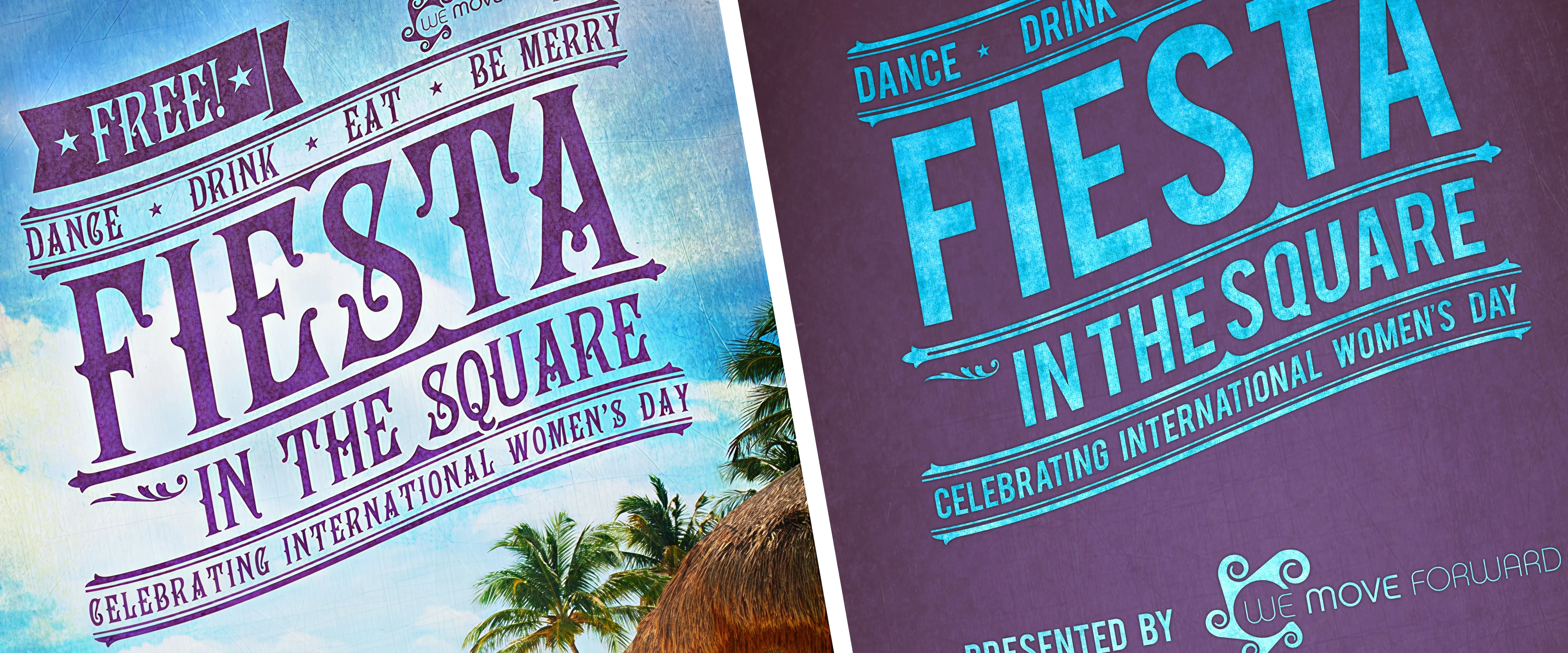
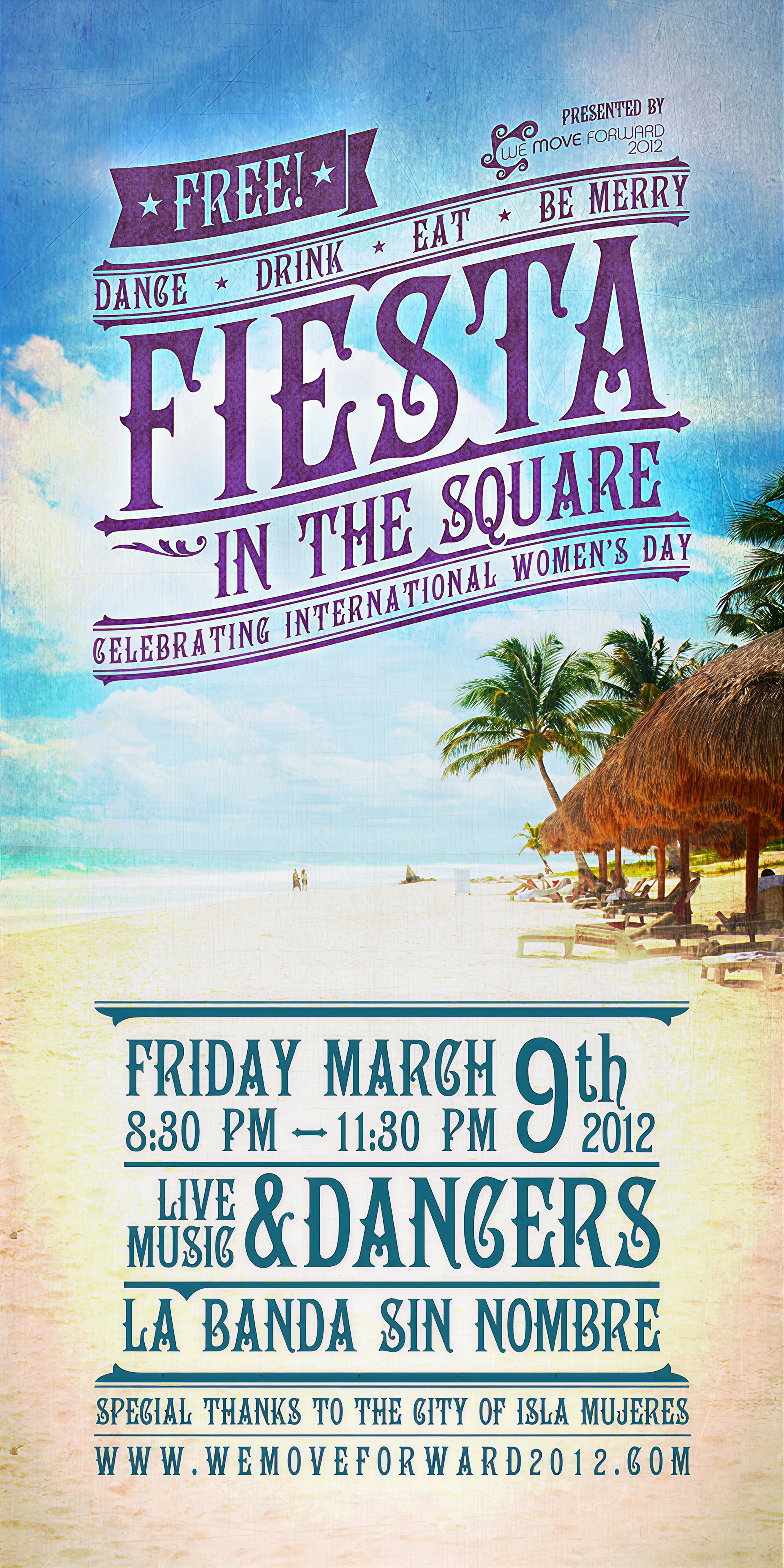
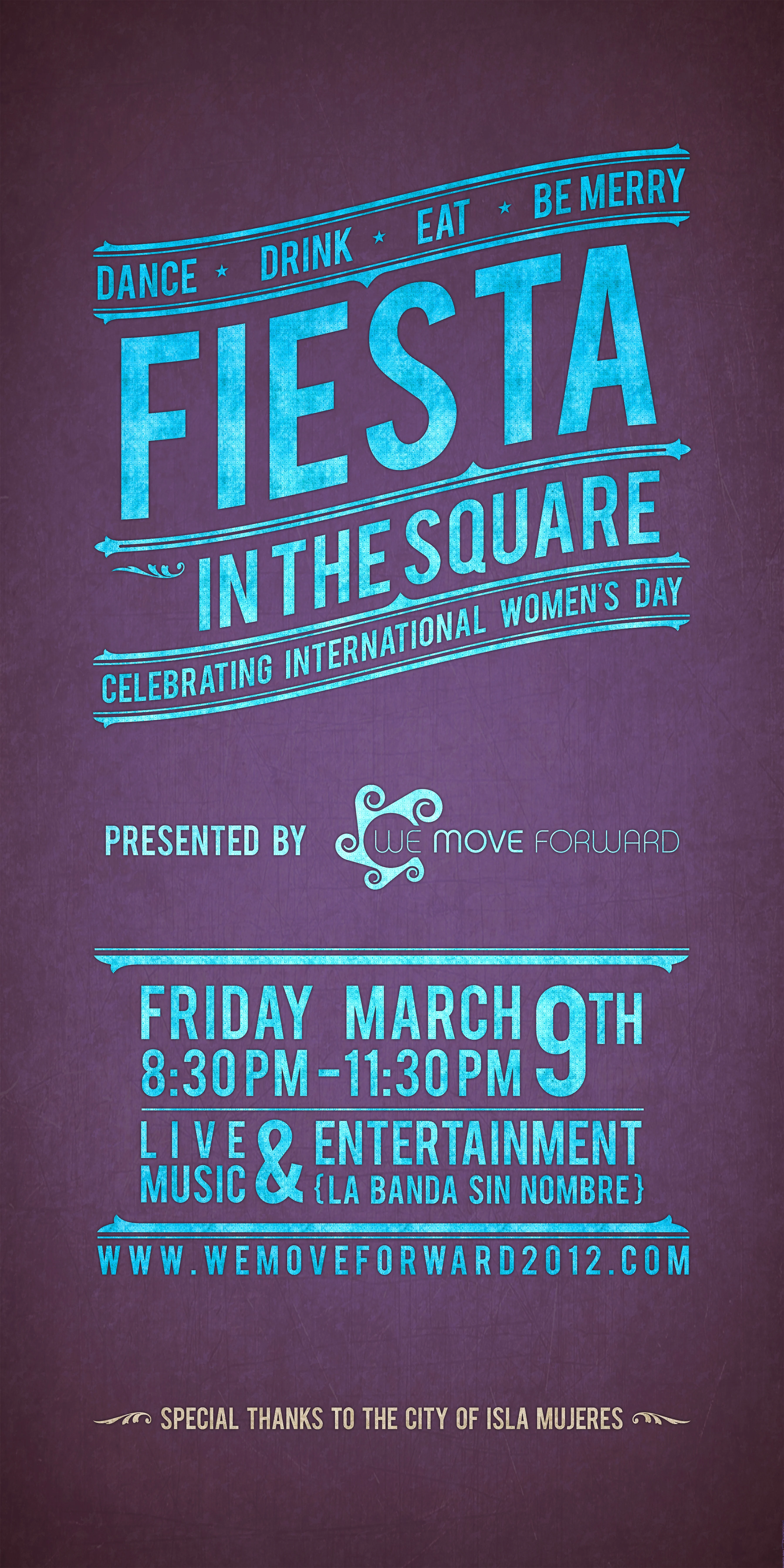
Created as part of a broader campaign for the “We Move Forward” conference based on Isla Mujeres, Mexico, these street banners were designed for their “Fiesta in the Square” event focused on celebrating International Women’s Day.
The first version used background imagery and typography indicative of the location — that of a beautiful Caribbean island off the coast of Cancun. The second version followed closer to the branding of the festival itself, with a bold sans-serif typeface and light colors on a dark background to maximize readability when shown outdoors.
Various & Sundry
A curated collection of logo marks and typographic lockups developed over the years — selected for their lasting significance in my practice and their role in shaping my approach to identity design.