I designed the brand identity, print, and packaging materials for Tiny Spa, an all-in-one "spa-in-a-bag" pampering kit intended for use anytime, anywhere.
The design uses nature inspired colors, playful iconography and friendly typography, which results in pleasing and easily identifiable packaging.
Brand guidelines
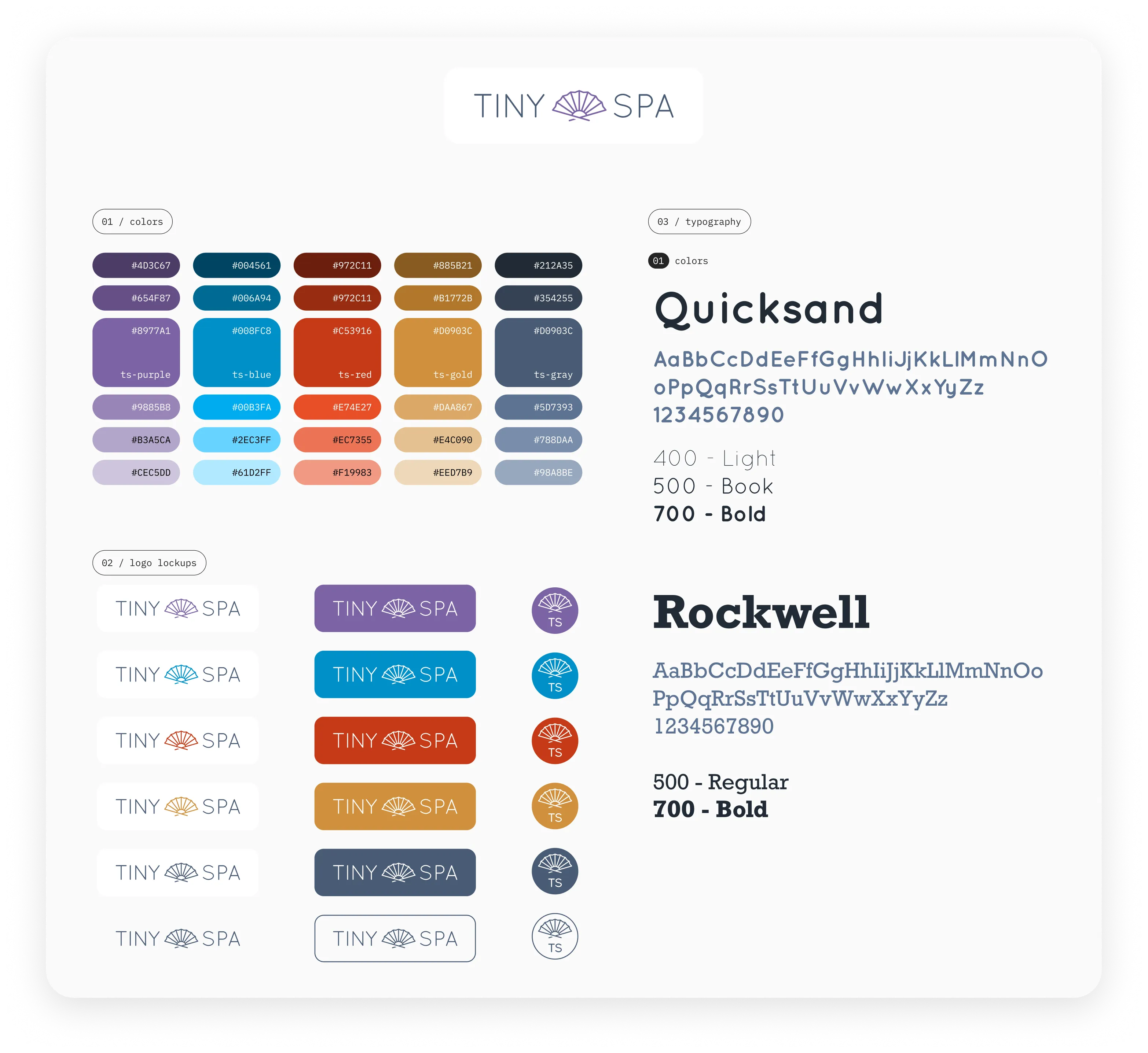
Tiny Spa uses the Quicksand typeface due to its calming, playful personality, paired with Rockwell — an equally playful typeface with a solid, grounding influence. Quicksand is used as the primary font to keep the packaging light and airy, while Rockwell is used sparingly as a grounding element, often reflecting the product colors to help further lighten the font.
The color ramp is based on bright earth tones used to portray feelings of calm, restoration, and relaxation. These are paired with a light warm gray used as a grounding element.
The logo itself is a playful take on a Japanese folding fan, which is a nod to the serenity and wellness one can achieve from simple actions of self care.
Restore Spa Kit
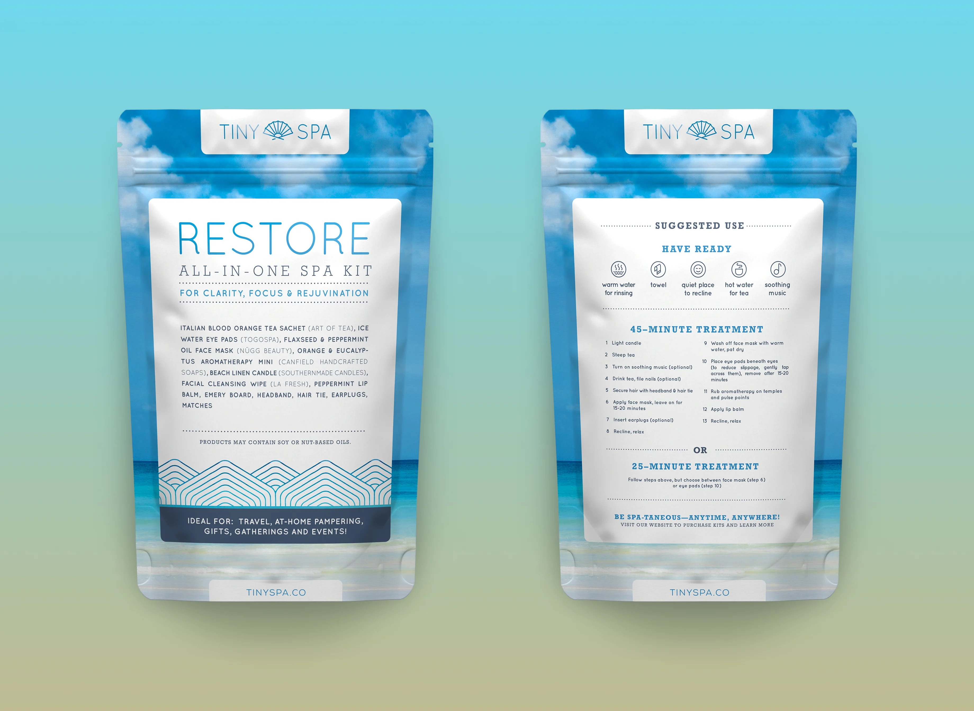
Created for “clarity, focus & rejuvenation”, the Restore kit uses bright yet calming colors paired with a tropical seascape background which brings to mind a refreshing beach walk.
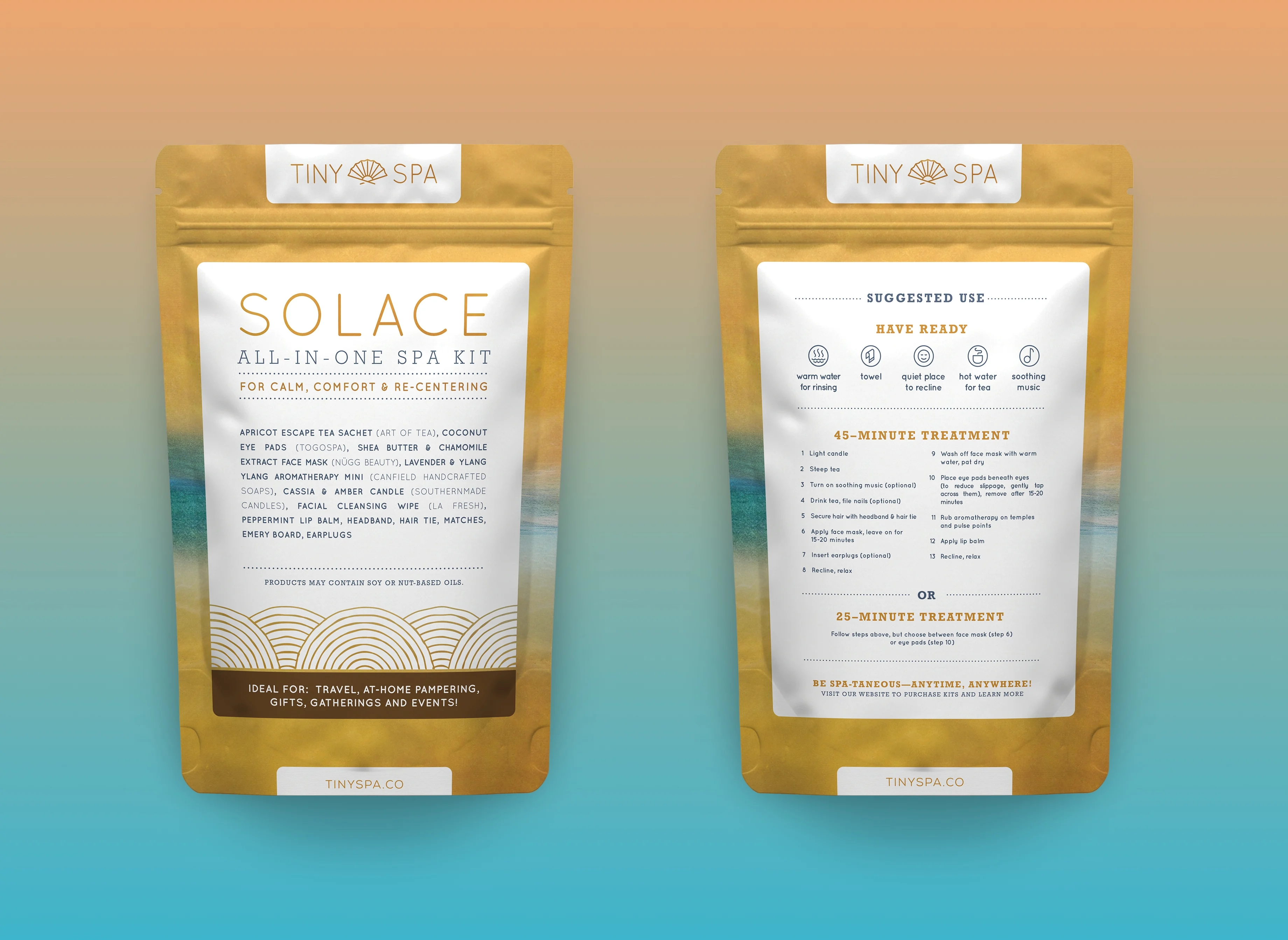
Solace Spa Kit
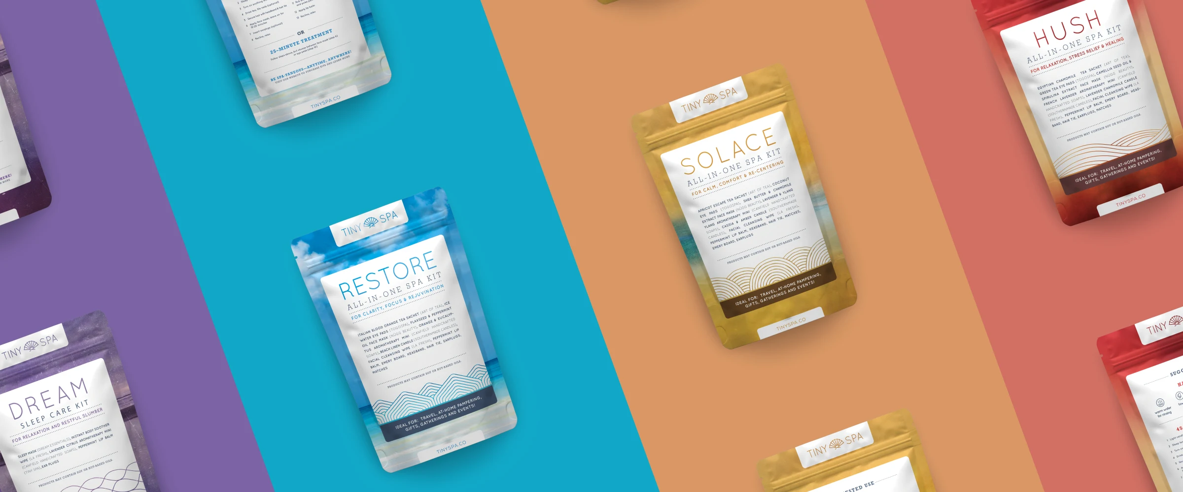
Solace uses a warm aqua and sunset color range to evoke the essence of “calm, comfort & re-centering”, encouraging users to practice self care in times of stress and worry.
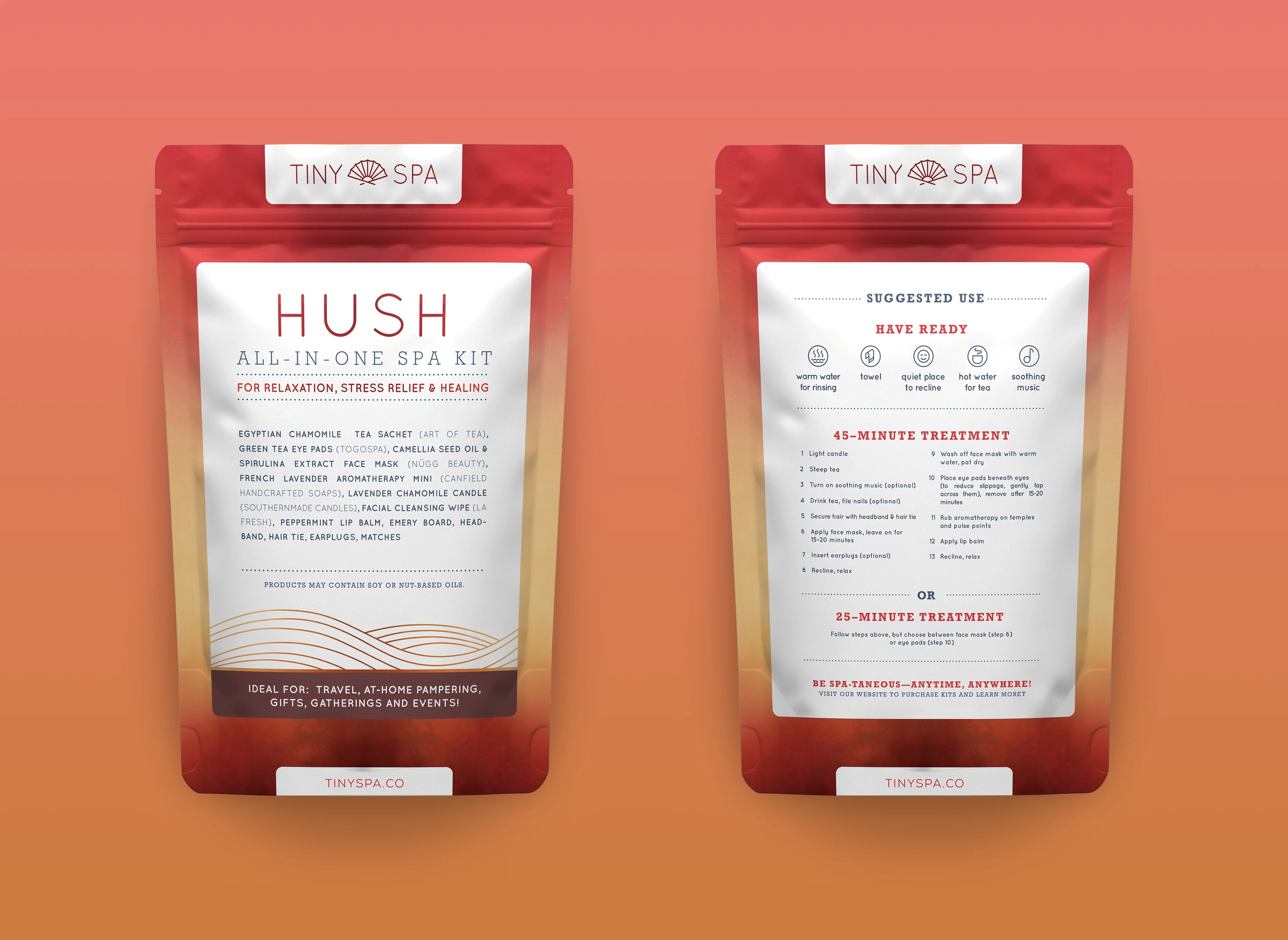
Hush Spa Kit
Hush uses cozy tones of yellow and red to instill thoughts of warmth, peace, and the healing glow of restorative solitude.
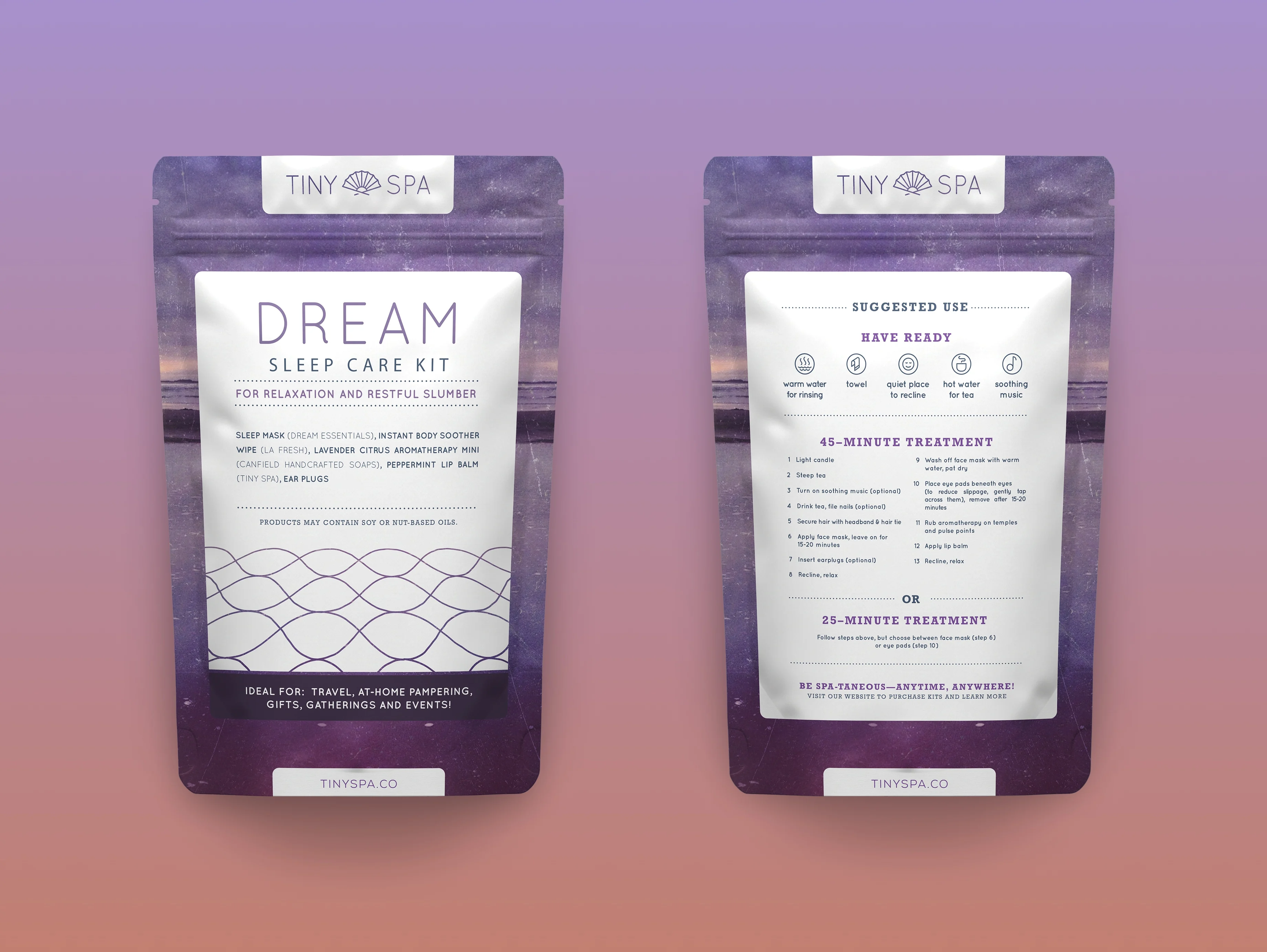
Dream Spa Kit
Intended for “relaxation and restful slumber”, the Dream kit uses a restful purple palette and soothing, wave-like geometric patterns to bring to mind the serene peacefulness of a seaside eventide.
Tiny Spa business cards